
By WhatsMyTrend
Great personal style begins with knowing how colors work together—not with owning more clothes.
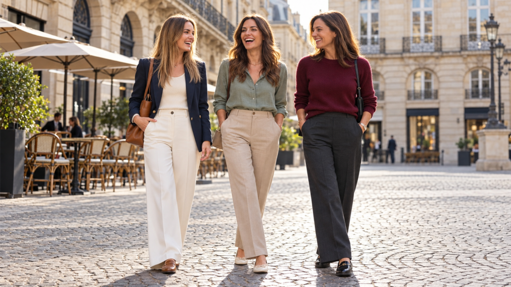
You have a closet full of clothes, yet somehow your favorite blouse never seems to work with your trousers. Your jacket looks beautiful on its own, but the complete outfit feels slightly disconnected. Often, the problem isn’t the clothing itself. It’s how the colors interact.
Learning how to match clothes colors makes getting dressed easier, helps you wear more of what you already own, and gives even simple outfits a more intentional appearance.
The good news? You don’t need to study advanced color theory or buy an entirely new wardrobe.
The easiest way to match clothing colors is to start with one neutral, choose a second color that complements it, and add an optional accent. For a more creative outfit, combine different shades of one color, neighboring colors on the color wheel, or contrasting colors in balanced proportions.
In this guide, we’ll explore practical color-matching methods, outfit examples, seasonal palettes, accessories, and common mistakes—so you can build combinations that feel natural to your personal style.
The Five Rules of Matching Clothes Colors
Quick styling takeaways
- Start with versatile neutrals such as white, black, navy, gray, cream, or beige.
- Choose one dominant color and use other colors to support it.
- Try monochromatic, analogous, or complementary color combinations.
- Consider the depth, brightness, and undertones of your clothing.
- Repeat an accent color through a handbag, scarf, shoes, or accessories for a coordinated finish.
These are styling tools, not restrictions. An outfit with four or five colors can look beautiful, just as an all-black outfit can feel interesting through texture and silhouette.
1. Understand the Clothing Color Wheel
The color wheel is one of the simplest tools for understanding why certain clothing colors look harmonious together while others create stronger contrast.
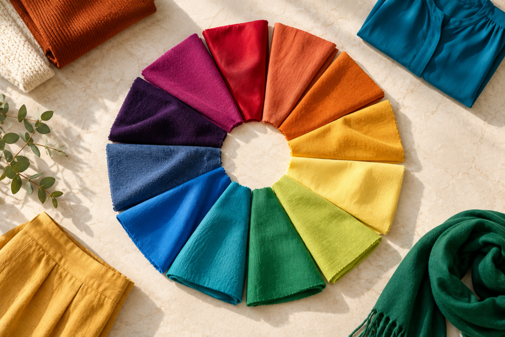
Color relationships help explain the difference between soft tonal outfits and high-contrast combinations.
Monochromatic colors
A monochromatic outfit uses different tones, tints, or shades of the same color.
For example, light blue, medium blue, and navy create a cohesive outfit without requiring identical shades.
Try a powder-blue shirt, navy trousers, and a denim-blue handbag.
This technique is especially useful when you want a streamlined outfit with subtle visual interest.
Analogous colors
Analogous colors sit next to one another on the color wheel.
Examples include blue with blue-green, or red with red-orange.
For everyday fashion, try teal with navy or coral with a soft peach shade. These combinations tend to create a gentle transition between colors.
Complementary colors
Complementary colors sit opposite one another on the color wheel.
Classic examples include blue and orange, red and green, and yellow and purple.
In clothing, these combinations often feel more wearable when one shade is softened.
Instead of bright orange with electric blue, try rust orange with navy. Instead of vivid red and green, try burgundy with muted sage.
Triadic colors
Triadic combinations use three hues spaced approximately evenly around the color wheel.
Red, yellow, and blue are a familiar example.
You can make this approach easier to wear by using one dominant color and introducing the other two in smaller amounts.
For a broader explanation, see Vogue’s guide to color theory for clothing .
2. Start With Neutral Colors
Neutral colors are the foundation of many versatile wardrobes because they can support both quiet and vibrant combinations.
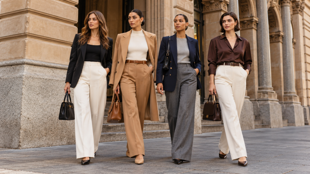
Black, ivory, camel, gray, navy, and brown provide reliable foundations for everyday outfits.
Some particularly useful neutral combinations include:
| Neutral color | Colors to try |
|---|---|
| Black | White, camel, gray, red, emerald |
| White | Navy, denim blue, olive, burgundy |
| Beige | Chocolate brown, black, sage, cream |
| Navy | White, camel, rust, blush pink |
| Gray | Burgundy, blue, lavender, white |
| Brown | Cream, pale blue, olive, soft pink |
How to style beige and cream
Beige and cream are especially effective when you want a softer alternative to stark black-and-white dressing.
A cream blouse with beige trousers creates a gentle tonal look. Add a chocolate-brown belt and handbag for definition.
If you prefer stronger contrast, pair beige trousers with a black knit top and black loafers.
The key is choosing shades that work together in your outfit’s overall mood, rather than insisting that every item has exactly the same undertone.
3. Try the Three-Color Outfit Method
If matching multiple colors feels complicated, the three-color method is an easy place to begin.
Choose a dominant color, a supporting color, and an accent.
A commonly used design guideline is the 60–30–10 proportion. For outfits, this is a visual starting point rather than a mathematical requirement.
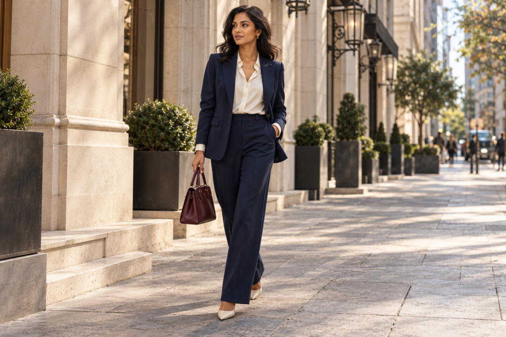
Example: Navy, cream, and burgundy
60%
Navy · dominant
30%
Cream · supporting
10%
Burgundy · accent
Illustrative proportions only. Actual outfit color balance depends on garment size, layering, and accessories.
For example, wear navy trousers and a navy blazer, add a cream blouse, and finish with a burgundy handbag.
You can also use two colors instead of three. A simple navy-and-white outfit may be exactly what your occasion calls for.
4. Ten Beautiful Outfit Color Combinations to Try
These combinations work across many personal styles and can be adapted to different silhouettes, budgets, and climates.
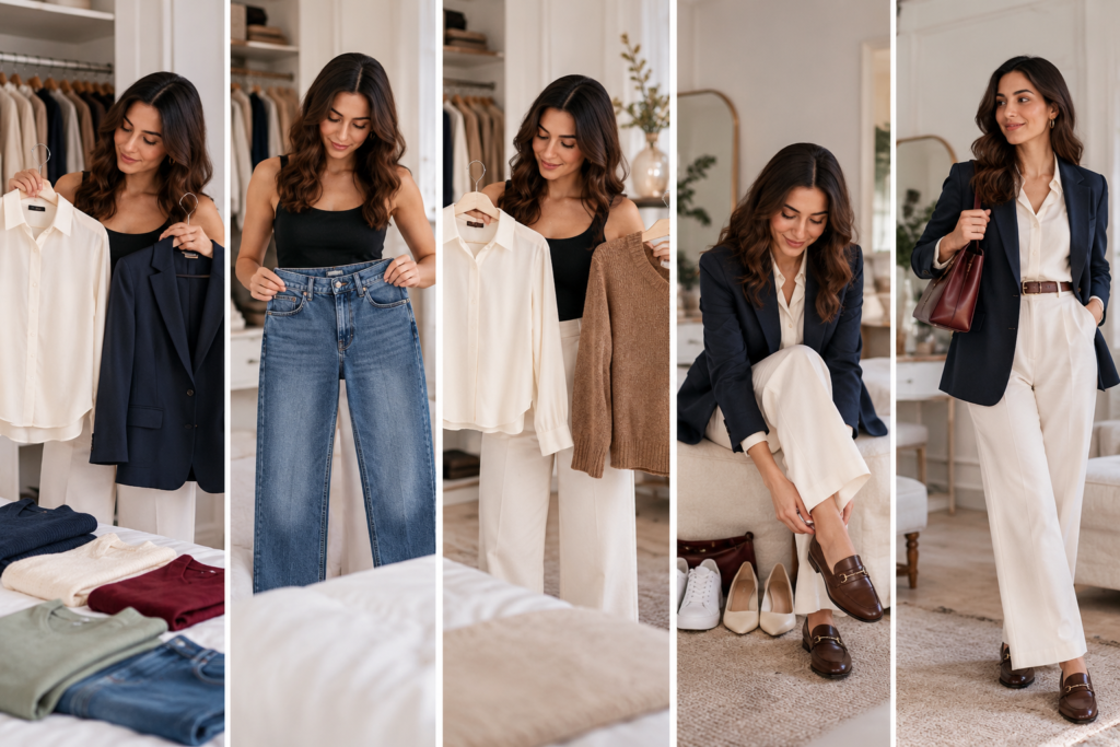
Outfit 1: Navy Blue and Cream — Timeless and Polished

Navy and cream offer a softer alternative to black and white while retaining a polished finish.
Navy creates visual depth, while cream adds lightness. The combination works beautifully for business casual dressing, lunch dates, and city weekends.
Try: Navy blazer + cream wide-leg trousers + ivory top + tan loafers.
Shop the inspiration: Browse coordinated essentials at Uniqlo
Outfit 2: Sage Green and Beige — Soft and Modern

Sage green brings gentle color to a beige outfit without overwhelming the neutral palette.
Sage and beige create a relaxed, understated look. Their muted quality makes them especially appealing for warm-weather outfits.
Try: Sage blouse + beige trousers + cream flats + tan bag.
Shop the inspiration: Browse contemporary separates at H&M
Outfit 3: Burgundy and Charcoal Gray — Refined Contrast
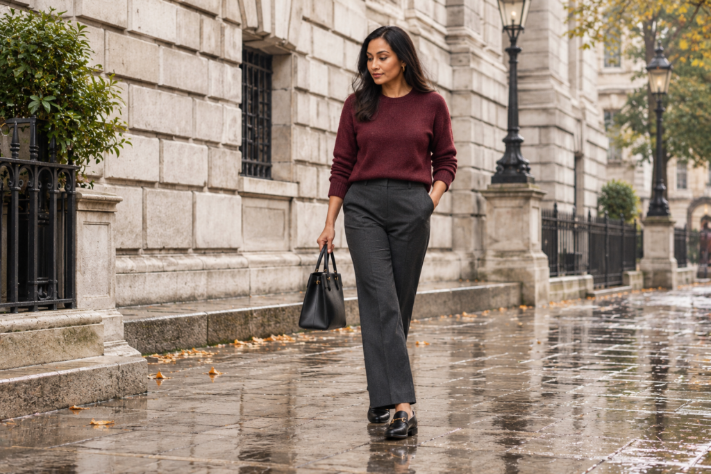
Burgundy adds richness to charcoal tailoring without the intensity of a brighter red.
This pairing works particularly well for fall and winter, but lighter fabrics can carry it into spring.
Try: Burgundy sweater + charcoal trousers + black flats.
Shop the inspiration: Browse knitwear and tailored trousers at Nordstrom
Outfit 4: White and Denim Blue — Everyday Casual

A white shirt and blue jeans remain a versatile foundation for casual color coordination.
White creates a clean contrast with denim, while a brown or tan accessory adds warmth.
Try: White shirt + straight-leg blue jeans + white sneakers + cognac bag.
Shop the inspiration: .
Outfit 5: Olive Green and Chocolate Brown — Earthy Elegance
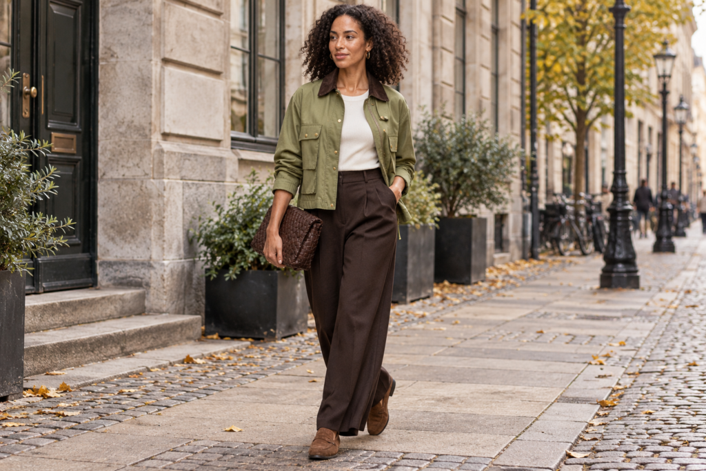
Olive and chocolate brown create an earthy palette that feels relaxed and sophisticated.
The combination works because both colors share a grounded, muted character.
Try: Olive jacket + brown trousers + ivory top + suede loafers.
Shop the inspiration: .
Outfit 6: Powder Blue and Camel — Understated Luxury

Cool powder blue brings freshness to the warmth of camel tailoring.
This is a useful example of how warm and cool colors can work together intentionally.
Try: Powder-blue knit + camel trousers + brown belt + loafers.
Shop the inspiration: .
Outfit 7: Black and Red — Confident Evening Style
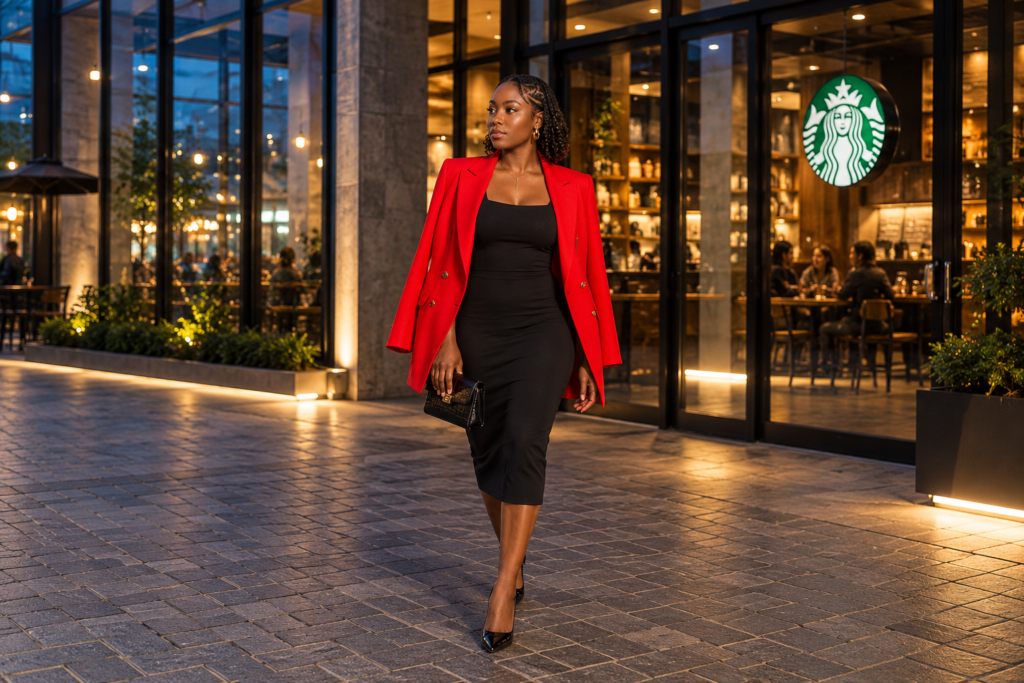
A red blazer becomes the focal point when paired with a simple black outfit.
A black base makes a bold red garment feel deliberate. Keep accessories minimal when you want the color contrast to lead.
Try: Black midi dress + red blazer + black kitten heels.
Shop the inspiration: .
Outfit 8: Lavender and Gray — Soft Contemporary Style
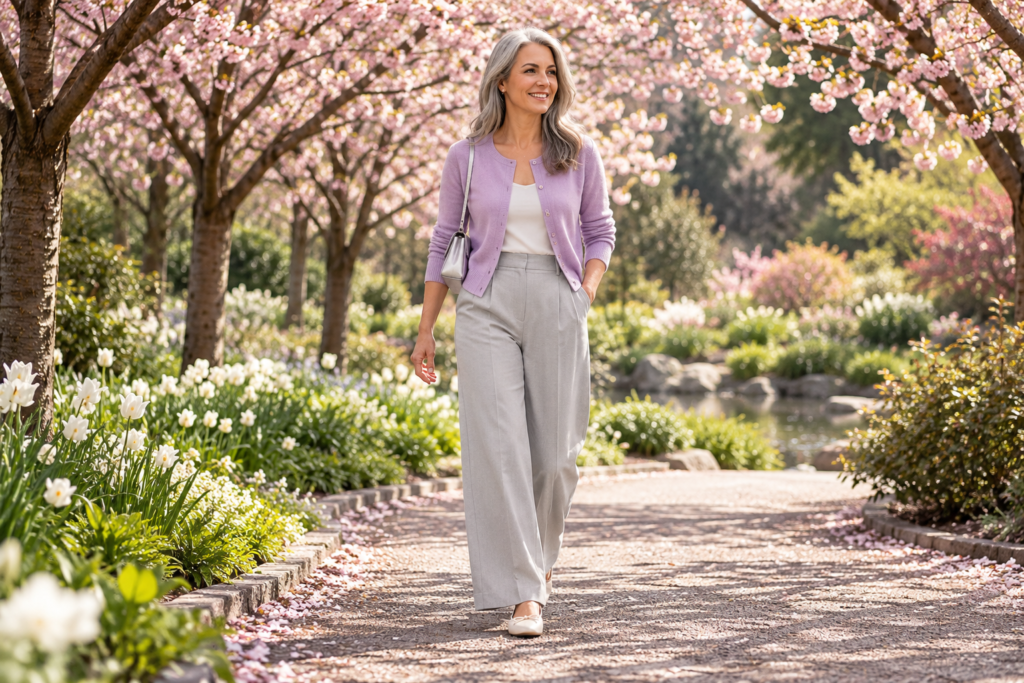
Lavender adds subtle personality to gray without creating a high-contrast outfit.
Light gray allows lavender to remain the main visual feature. Silver accessories can reinforce the cool-toned effect.
Try: Lavender cardigan + gray trousers + ivory flats.
Shop the inspiration: .
Outfit 9: Rust Orange and Navy — Warm Meets Cool
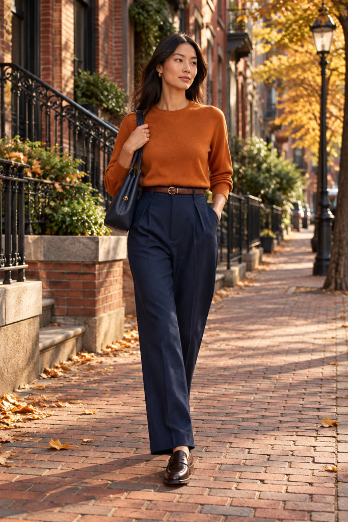
Rust and navy offer a wearable interpretation of the blue-and-orange complementary relationship.
Deep navy reduces the intensity of the pairing, while rust introduces warmth.
Try: Rust knit + navy trousers + brown loafers.
Shop the inspiration: .
Outfit 10: Blush Pink and Chocolate Brown — Romantic but Grounded
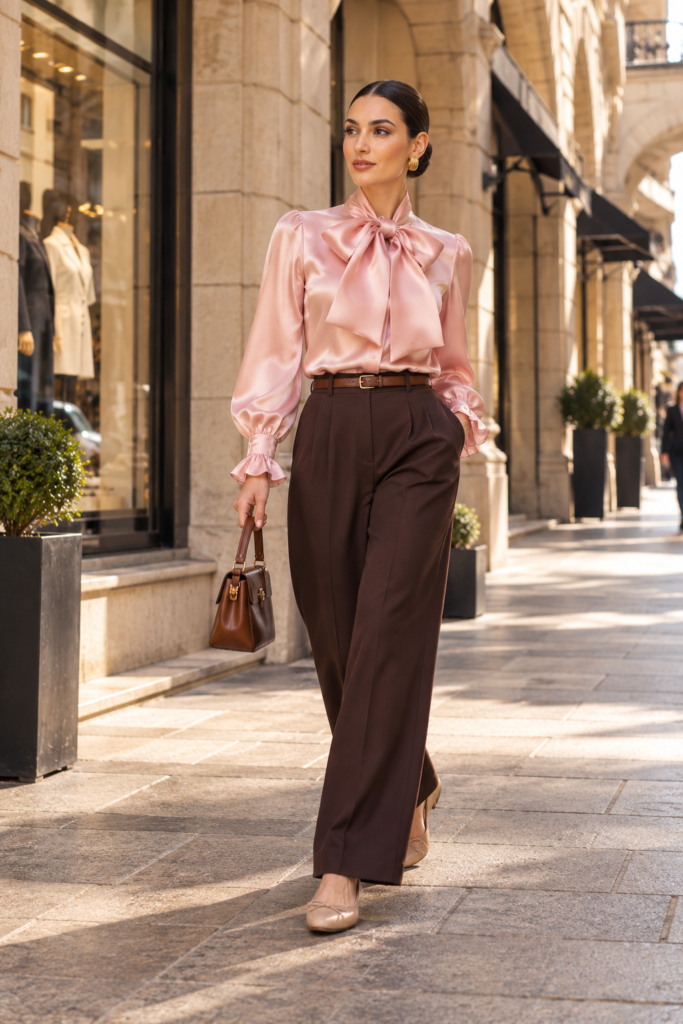
Chocolate brown adds depth to blush pink, creating a softer alternative to pink and black.
This combination works particularly well when the pink is muted rather than highly saturated.
Try: Blush blouse + chocolate trousers + nude flats.
Shop the inspiration: .
5. Match Colors to the Occasion
The same color combination can communicate different moods depending on garment shape, fabric, and accessories.
| Occasion | Suggested colors | Outfit idea |
|---|---|---|
| Casual weekend | White + denim + tan | White tee, blue jeans, tan bag |
| Office | Navy + cream + brown | Navy blazer, cream trousers |
| Date night | Burgundy + black | Burgundy blouse, black skirt |
| Summer vacation | Sage + white | Sage linen shirt, white shorts |
| Fall outing | Camel + chocolate | Camel coat, brown knit |
| Evening event | Black + red | Black dress, red jacket |
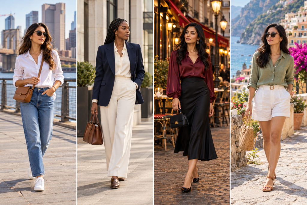
For formal environments, muted colors and tailored pieces can feel understated. For creative workplaces, stronger color combinations may be entirely appropriate.
Always consider the actual dress code rather than assuming a particular color is automatically professional or inappropriate.
6. Choose Colors That Work With Your Personal Coloring
You may have heard that everyone has a seasonal color palette, such as spring, summer, autumn, or winter.
Seasonal color analysis can be a useful styling framework, but it isn’t a universal rule. Skin tone, undertone, hair color, contrast, personal taste, lighting, and fabric all influence how a color appears.
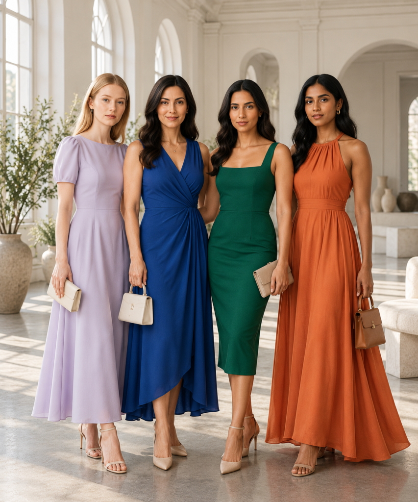
Experimenting with different color families is often more useful than treating personal color categories as strict rules.
If you want to explore your most comfortable colors, start by comparing garments near your face in natural daylight.
Look at how different shades interact with your complexion and hair, but also pay attention to which ones make you feel confident.
You might prefer warm rust and camel, cool blue and lavender, or a combination of both.
Important: No skin tone is limited to a specific set of clothing colors. Personal preferences, cultural expression, and individual styling choices matter.
7. Match Your Accessories Without Making Everything Identical
Matching your shoes, handbag, and belt exactly can create a coordinated look, but it isn’t necessary.
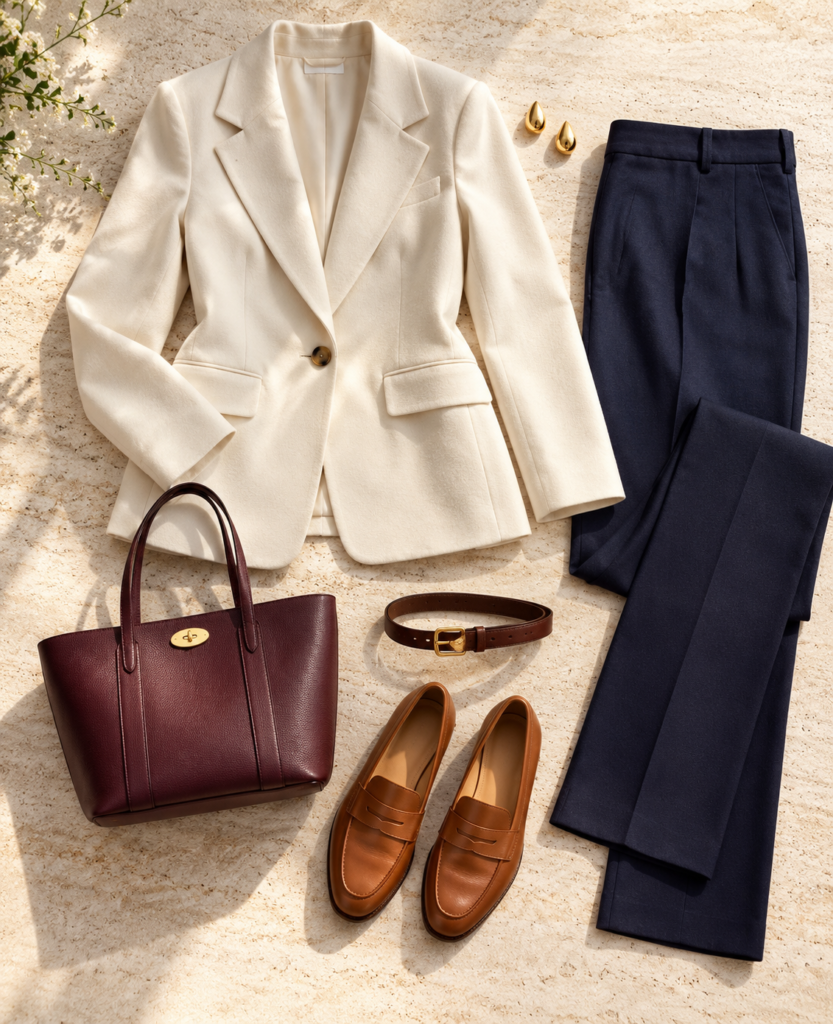
A burgundy handbag introduces an accent color to a navy-and-cream outfit, while brown accessories add warmth.
Instead, try connecting your accessories through one shared element.
For example, brown loafers and a brown belt can tie together a navy-and-cream outfit. A burgundy handbag can introduce a separate accent without looking disconnected.
Metallic accessories can also function as neutrals. Gold often adds warmth, while silver creates a cooler impression, but mixing metals is a valid style choice.
If your outfit already contains several saturated colors, simpler accessories can provide visual breathing room.
8. How to Match Prints and Patterns
Patterns are often easier to style when you treat the colors inside them as a ready-made palette.
Suppose you own a blouse with navy, cream, and burgundy flowers.
Rather than introducing an entirely new color, choose trousers in navy or cream and repeat burgundy through a small accessory.
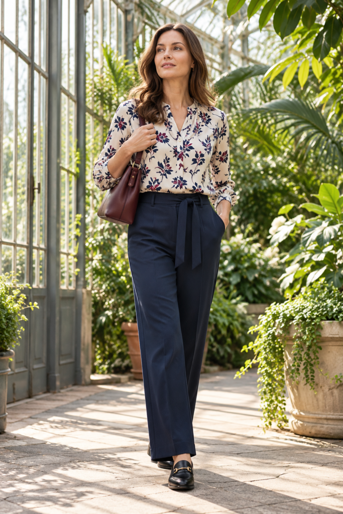
Pulling one color from a printed blouse into your trousers or accessories makes patterned outfits easier to coordinate.
When mixing two prints, pay attention to scale. A fine stripe can work with a larger floral pattern when the colors connect.
There is no requirement that every pattern share the exact same colors, but repeating one hue is a beginner-friendly technique.
9. Build a Small Wardrobe Color Palette
A coordinated wardrobe doesn’t require every item to be neutral.
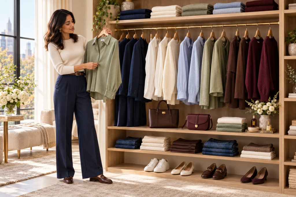
Instead, choose a small group of colors that you enjoy wearing and can combine in multiple ways.
For example:
- Base neutrals: navy, cream, chocolate brown.
- Supporting colors: sage green, light blue.
- Accent color: burgundy.
This gives you several outfit possibilities without forcing every garment to match everything else.
Before buying a new piece, consider whether you can style it with at least three items you already own. This is a shopping filter, not a rule that should prevent you from buying a special statement piece.
10. Seasonal Outfit Color Combinations

Seasonal palettes can provide inspiration, but your favorite colors can be worn year-round with suitable fabrics and layers.
Spring
Try sage green, soft pink, pale blue, cream, and lavender. These colors feel especially fresh when paired with lightweight knits and cotton.
Summer
White, sky blue, coral, sand, and olive can work beautifully with linen, cotton, and breathable fabrics.
Fall
Rust, burgundy, chocolate brown, camel, and forest green complement heavier textures such as corduroy, denim, and wool.
Winter
Charcoal, navy, cream, burgundy, emerald, and black work well with structured coats and layered knitwear.
These palettes are suggestions, not seasonal restrictions. A red sweater can be beautiful in spring, just as white trousers can look sophisticated in winter.
11. Common Outfit Color-Matching Mistakes
Using too many strong colors without a focal point. When every garment competes for attention, the outfit can feel visually busy. Try allowing one bold piece to lead.
Ignoring color depth. A very pale top with pale trousers creates a different impression from a pale top with dark trousers. Neither is wrong, but the amount of contrast changes the look.
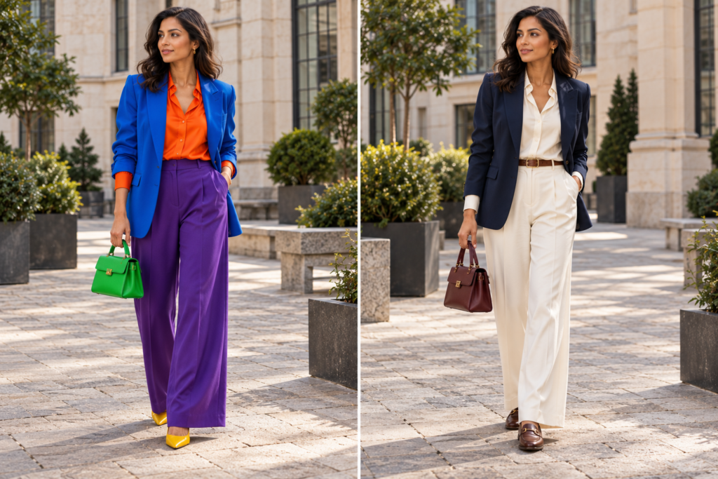
Assuming all neutrals are identical. Warm cream, cool white, taupe, and beige have different undertones. Compare them together rather than assuming they’ll automatically match.
Matching everything too precisely. Identical shoes, bags, belts, and accessories can sometimes make an outfit feel overly coordinated. Experiment with related shades.
Forgetting fabric texture. Two pieces in the same color can look very different in silk, wool, cotton, and leather. Texture can be an asset, especially in monochromatic outfits.
Buying colors that don’t work with your wardrobe. A beautiful item may be less useful if you don’t enjoy pairing it with your existing clothes.
12. A Five-Minute Outfit Color-Matching Routine
Your daily outfit checklist
0 of 5
Choose one item you want to wear today.
Identify its dominant color.
Add a neutral or a related color.
Decide whether you want a subtle or bold accent.
Check the full outfit in natural light, including shoes and accessories.
This routine can be especially helpful when you feel stuck between two outfit choices.
Take a quick photo if you want to compare combinations side by side. Looking at the whole silhouette often makes color balance easier to assess.
Frequently Asked Questions
What is the easiest way to match clothes colors?
Start with one neutral color such as navy, white, black, beige, or gray. Add a second color that creates the mood you want, then use an optional accent through accessories.
What three colors go well together in an outfit?
Navy, cream, and burgundy make a polished combination. Other options include beige, sage, and brown; black, white, and red; or gray, lavender, and ivory.
Can you wear black and brown together?
Yes. Black and brown can create a sophisticated outfit, especially when the difference between the shades is intentional. Try black trousers with a chocolate-brown sweater and black shoes.
Is it okay to wear more than three colors?
Absolutely. Three colors are a useful beginner guideline, not a fashion rule. Multiple colors can look cohesive when they share a common mood, repeat throughout the outfit, or have a clear visual hierarchy.
Do shoes have to match your handbag?
No. Shoes and handbags can match, but they can also coordinate through similar tones, materials, or overall styling.
How do you match bright colors without looking too colorful?
Pair one bright garment with neutrals or softer versions of related colors. For example, wear a cobalt-blue sweater with charcoal trousers and black loafers.
Do warm and cool colors go together?
Yes. Warm and cool colors can create attractive contrast. Powder blue with camel and rust with navy are two examples.
Which clothing colors are most versatile?
Navy, white, black, gray, cream, beige, and brown are useful starting points. The most versatile choices for you will depend on the clothes you already wear and your preferred personal style.
Final Thoughts: Wear Colors With Confidence
Understanding how to match clothes colors isn’t about memorizing dozens of combinations or following rigid rules.
Start with neutrals, explore tonal dressing, experiment with color-wheel relationships, and learn which combinations feel comfortable for your everyday life.
Some days, a white shirt and blue jeans will be enough. Other days, you may want to wear a burgundy sweater with charcoal trousers or a bright red blazer over a black dress.
The best outfit color combination is one that feels intentional, suits the occasion, and expresses your style.
You don’t need a bigger wardrobe to start experimenting. You may already have the perfect color combinations waiting in your closet.


6 thoughts on “How to Match Clothes Colors for Outfits: A Complete Style Guide”